Component Builder
What Is the Component Builder?
The Component Builder is Myop's built-in development environment for creating, editing, and publishing UI components — directly from your browser. It provides a code editor, live preview, configuration panel, and testing tools all in one place, so you can build and iterate on components without switching between tools.
Whether you're starting from scratch or modifying an existing component, the Component Builder gives you everything you need to go from idea to production.

Key Features
- Integrated Code Editor — A full Monaco editor (the same engine behind VS Code) with syntax highlighting, autocomplete, and error detection.
- Live Preview — See your changes rendered in real time as you type, with split-view or full-screen options.
- Variant Management — Create, switch between, and duplicate variants of your component to test different versions.
- Test Data Scenarios — Define mock data inputs to test how your component behaves with different data.
- One-Click Publish — Save and publish your component to a live environment instantly.
- Myop Agent — An AI assistant integrated into the builder to help you write and modify code.
- Connect & Integrate — Generate ready-to-use code snippets, npm packages, or prompts for integrating your component into your application or platform.
- Tags & Organization — Categorize components with tags for easy discovery.
- Sharing & Access — Control component visibility with public/private access.
Interface Overview
The Component Builder is divided into three main areas:
Top Bar
The top bar contains navigation and actions:
- Component Selector — Switch between components or create a new one.
- Variant Selector — Switch between variants of the current component, or add a new variant.
- Variant Description — Add a short description to the current variant.
- Save — Save the current variant code to the server.
- Publish Live — Publish the saved variant to your live environment.

Left Panel
The left panel can be collapsed and expanded using the toggle button, giving you more space for the code editor and preview when needed. It has two tabs:
Configuration Tab
- Tags — Assign tags to organize and categorize your component.
- Data Flow — View the input and output methods detected in your code, and inspect the TypeScript interface.
- Testing — Create and run test data scenarios to validate your component.
- Connect — Generate integration code snippets for your host application.
- Sharing & Access — Toggle public/private visibility.

Myop Agent Tab
An AI-powered coding assistant built into the Component Builder. Key capabilities:
- Build & edit components — Describe what you want in natural language and the agent will generate or modify your component code.
- Multi-turn conversations — Refine your component iteratively across multiple messages, with full conversation history.
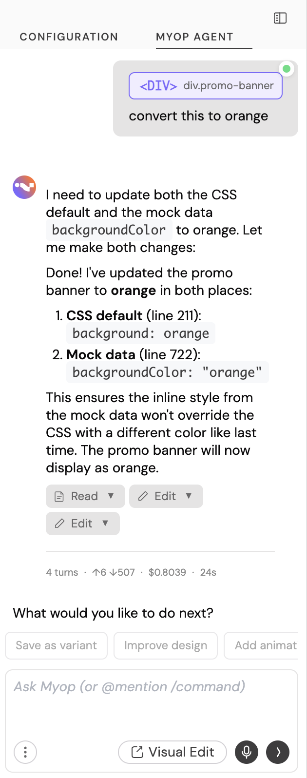
- Element selection — Click on any element in the preview and ask the agent to modify it directly.
- Test scenario generation — Ask the agent to create test data scenarios (DTOs), which are automatically added to your configuration on save.
- Version history — Revert to any previous point in the conversation if needed.
- Agent / Ask modes — Switch between full editing mode and a read-only ask mode for questions without making changes.
- Model selection — Choose between Haiku (fast), Sonnet (balanced), or Opus (most capable) depending on your task complexity.
- Voice to text — Use your microphone to describe changes by voice instead of typing.
- Stop anytime — Stop the agent mid-response if you see it heading in the wrong direction, saving time and tokens.
@context selector — Type@in the input to open a context menu where you can reference specific colors or element selectors from your component, giving the agent precise context about what you want to change./commands — Type/to access quick commands such as starting a new conversation or loading a previous one.- Take a screenshot — Capture a screenshot of a webpage or design and share it with the agent as a visual reference.
- Upload screenshots & assets — Upload images, icons, or other assets directly into the conversation. The agent can use them as part of your component (e.g., as backgrounds, logos, or icons).
- External integrations — Connect to Figma and Chrome DevTools via MCP for design-to-code workflows and live debugging.
Main Panel
The main panel is where you write code and preview your component:
- Preview View — See your component rendered live.
- Code View — Write and edit HTML, CSS, and JavaScript in the Monaco editor.
- Split View — See code and preview side by side.
- Paste to Replace — Replace the entire editor content with code from your clipboard. Useful when pasting code from an external AI tool or another source.
- Copy Code — Copy the current editor content to your clipboard.
- Download Code — Download the current variant code as an HTML file for local use or backup.
- Mobile/Desktop Toggle — Switch the preview between desktop and mobile viewport to test responsive behavior.
- Console — View console output and errors from your component.

Getting Started: Create Your First Component
Step 1: Open the Component Builder
Navigate to the Myop Dashboard and click New Component. The Component Builder will open with a starter template.
Step 2: Name Your Component
Click on the component name field in the top bar and type a name for your component (e.g., "Pricing Card").
Step 3: Write Your Code
The editor starts with a basic template:
<!-- Start coding here -->
<div>This is my component</div>

<script>

// Called on initialization and whenever the host sends
// configuration or state updates to this component
myop_init_interface = () => {}

// Provided by the host — call this function to send data
// or trigger actions in the host app
myop_cta_handler = () => {}

</script>
Replace this with your own HTML, CSS, and JavaScript. Your component communicates with the host application through two global functions:
| Function | Direction | Purpose |
|---|---|---|
myop_init_interface(data) | Host → Component | Receive data from the host app |
myop_cta_handler(action_id, payload) | Component → Host | Send actions back to the host app |
You can use the Myop Agent to modify and create your component code. See the Myop Agent Tab section below for more details.
Step 4: Preview Your Component
Use the tab buttons at the top of the main panel to switch between views:
- Preview — See the rendered output.
- Code — Focus on writing code.
- Split — View both side by side.

Step 5: Test Your Component with Different Data
Use Test Data Scenarios in the left panel to preview your component in different states — for example, an empty cart, a full cart, or an error state. See Testing with Test Data Scenarios for more details.
Step 6: Save Your Component
Click the Save button in the top bar. If this is a new component, Myop will create it on the server and assign it an ID. If it's an existing component, it will save your changes to the current variant.

Step 7: Publish Live
Once you're happy with your component, click Publish Live to deploy it to your environment. Published variants are locked to prevent accidental edits — to make further changes, create a new variant.
Managing Variants
Variants let you maintain multiple versions of a component. Each variant has its own code, name, and description.

Create a New Variant
- Click the + button next to the variant selector in the top bar.
- Enter a name for the new variant.
- The new variant opens in the editor with a copy of the current code.
Duplicate a Variant
To create a variant based on an existing one, use the variant menu to duplicate it. The new variant will contain a copy of the original code.
Switch Between Variants
Click the variant name or chevron in the top bar to open the variant dropdown, then select the variant you want to edit.
If you have unsaved changes when switching variants, the builder will prompt you to confirm before discarding them.
Published Variants Are Locked
Once a variant is published (has a release), its code is locked to prevent unintended changes. To iterate further, create a new variant from the published one.
Testing with Test Data Scenarios
Test data scenarios let you preview how your component behaves with different inputs without connecting to a real host application.
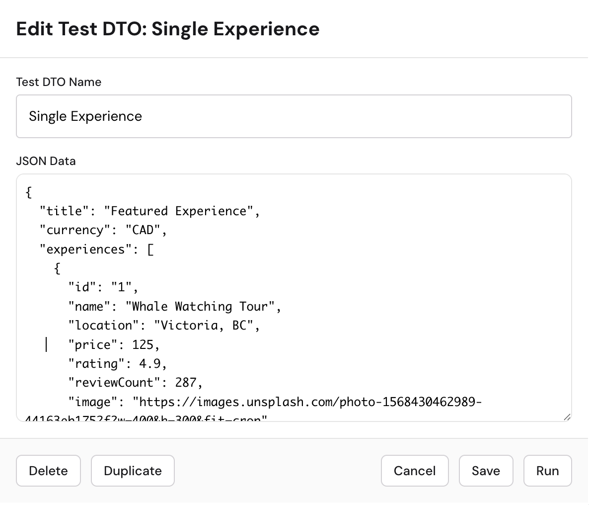
Create a Test Scenario Manually
- Expand the Testing section in the left panel.
- Click + Add scenario.
- Give it a name (e.g., "Empty Cart", "Full Cart", "Error State").
- Enter the JSON data that describes the state you want to test.
- Click Run to see how your component renders with that data.
Create a Test Scenario with Myop Agent
You can also use the Myop Agent to create test scenarios without writing JSON by hand. Simply describe the state you'd like to test (e.g., "show a cart with 3 items and a discount applied"), and after clicking the Save button within the agent, a new test scenario is automatically added to your configuration.
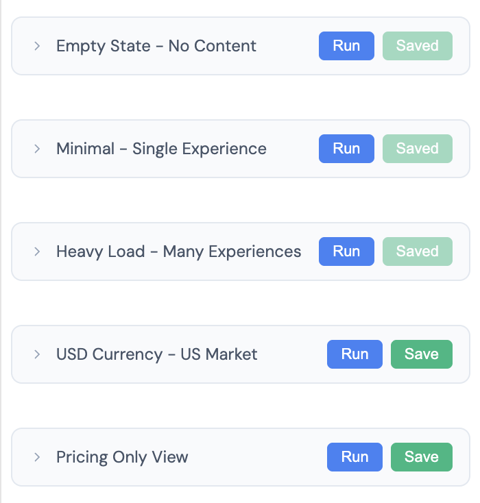
Manage Test Scenarios
- Edit — Click on an existing test scenario to modify its name or data.
- Save — Save your changes without running the scenario.
- Run — Save and run the scenario in a single click, so you can immediately see how your component renders with the updated data.
- Duplicate — Create a copy of a test scenario to quickly create variations.
- Delete — Remove test scenarios you no longer need.
Data Flow
The Data Flow section in the left panel shows the input and output methods detected in your component code:
- Input — Functions like
myop_init_interfacethat receive data from the host. - Output — Calls to
myop_cta_handlerthat send actions to the host.
TypeScript Interface
When you build a component using the Myop Agent or the provided AI prompt, TypeScript type definitions are automatically generated and embedded in your component code. These types describe the data contract between your component and the host application — what data myop_init_interface expects, and what actions and payloads myop_cta_handler can send.
The Data Flow section in the left panel reads these type definitions and displays the detected input and output methods. This is useful for:
- Understanding the data contract between your component and the host at a glance.
- Sharing the expected data shape with other developers.
- Ensuring type safety when integrating the component into your host application.
These types are embedded in your component code inside a <script type="myop/types"> block. You can view this block directly in the code editor to see the full type definitions of your component.

Connect: Integrate Into Your App
The Connect section generates ready-to-use code snippets for integrating your component into a host application.
- Expand the Connect section in the left panel.
- Click the Connect button.
- Choose your framework or platform of the host application.
- Copy the generated code snippet, npm package or prompt into your application / platform.
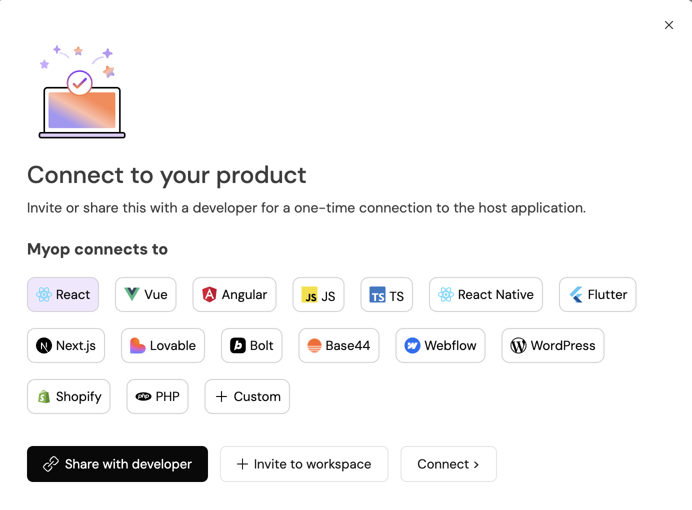
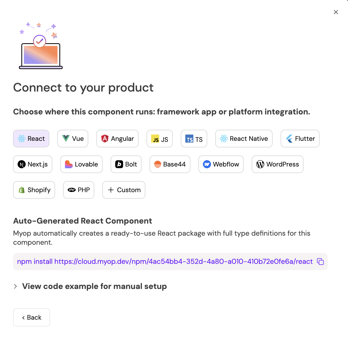
If you're a non-developer, you can click the Share with developer button to share the component with a developer for integration.

Tags
Tags help you organize and find components across your dashboard.
- Expand the Tags section in the left panel.
- Start typing to search existing tags or create a new one.
- Press Enter to add a tag.
- Click the x on a tag to remove it.
Tags are shared across your organization, so consistent naming helps the whole team.

Sharing & Access
Control who can access your component:
- Expand the Sharing & Access section in the left panel.
- Click Make Public to toggle the component's visibility.
- Public — Anyone with the link can view the component.
- Private — Only members of your organization can access it.
Myop Agent
The Myop Agent is an AI assistant embedded directly into the Component Builder. For a full list of its capabilities — including element selection, voice input, screenshot uploads, model selection, and more — see the Myop Agent Tab section above.
To get started:
- Click the Myop Agent tab in the left panel.
- Describe what you want to build or change.
- The agent will generate or modify code in the editor.
The Myop Agent works best when you give it clear, specific instructions — for example, "Add a loading spinner that shows while data is being fetched" or "Change the card layout to a horizontal orientation."