Rollout
What Is the Rollout Screen?
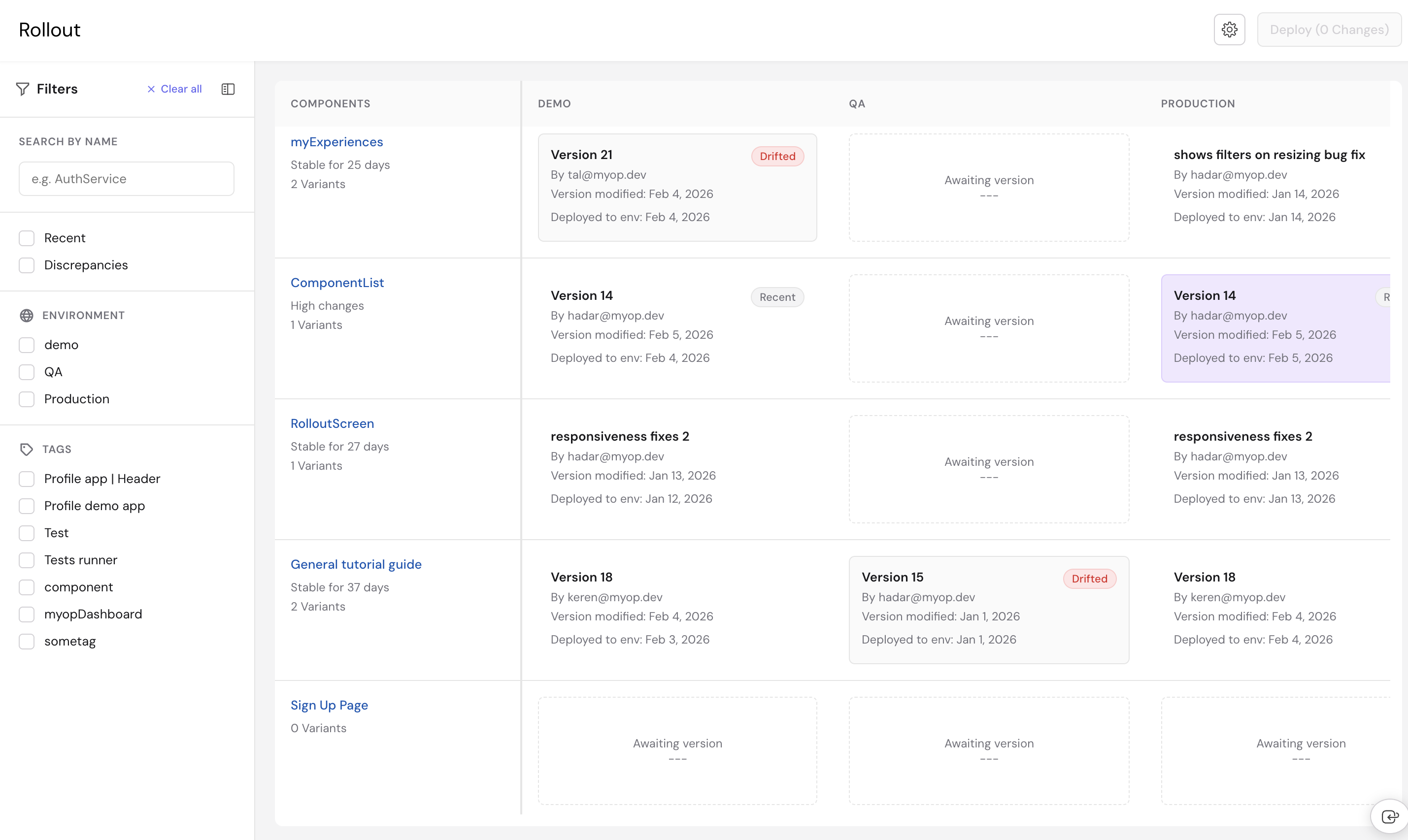
The Rollout screen is Myop's deployment management interface. It gives you a centralized control board to view, manage, and deploy component variants across multiple environments — such as Dev, QA, and Production — all from a single view.
Whether you're promoting a component from staging to production or checking which version is live in each environment, the Rollout screen helps you stay in control of your deployments.
Key Features
- Deployment Control Board — View all your components and their deployed versions across every environment in a single table.
- Version Selection — Choose which variant to deploy to each environment.
- Batch Deploy — Queue multiple version changes and deploy them all at once.
- Discrepancy Detection — Identify environments where a component version differs from Production.
- Search & Filter — Find components by name, filter by tags, environments, recent changes, or discrepancies.
- Environment Management — Add, edit, or remove deployment environments from the settings.
- Status Indicators — See at a glance which versions are drifted, recently changed, or pending deployment.
- Issue Tracking — Flag and track issues on specific component deployments.
- Mobile Responsive — Full mobile support with a filter drawer, mobile search, and adaptive layout.
Interface Overview
The Rollout screen is divided into three main areas: a top bar, a left sidebar for filters, and the main control board table.
Top Bar
The top bar contains:
- Settings — Open environment configuration.
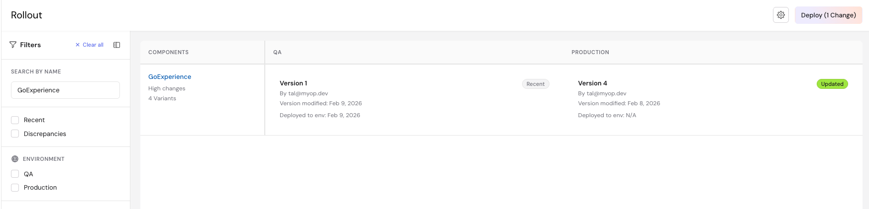
- Deploy Button — Deploy all queued changes. Shows the number of pending changes (e.g., "Deploy (3 Changes)"). Disabled when no changes are queued.

Left Sidebar (Filters)
The left sidebar can be collapsed and expanded using the toggle button, giving you more space for the table. It contains:
- Search by Name — Filter components by name.
- Recent — Checkbox to show only components with recent deployments (within the last 3 days).
- Discrepancies — Checkbox to show only components with version differences across environments.
- Environment — Filter components by specific environments. Only components deployed to all selected environments are shown.
- Tags — Filter components by tags. Tags are populated dynamically from your components.
- Clear All — Reset all filters at once.

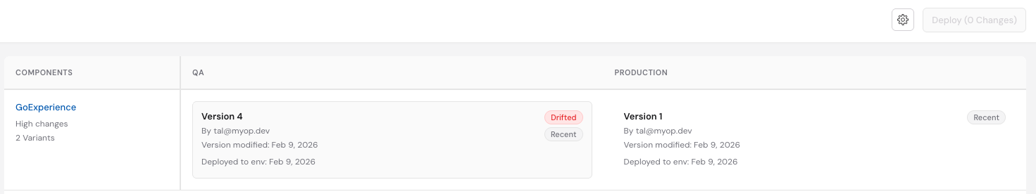
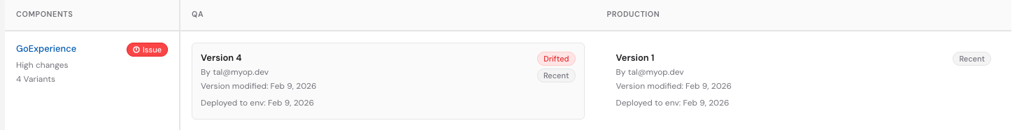
Control Board Table
The main area of the Rollout screen is a table that maps components (rows) to environments (columns). Each cell shows the variant currently deployed to that environment.
- Component Column — Lists all your components. Each row shows the component name (clickable to navigate to the component page), stability status, and number of variants. The component column stays fixed when scrolling horizontally.
- Environment Columns — One column per environment (e.g., Dev, QA, E-Prod, Production). Each cell shows the deployed variant name, developer, version modification date, and deployment date.

Status Badges
Cells in the table may display status badges to help you quickly identify what needs attention:
| Badge | Meaning |
|---|---|
| Drifted | The deployed version differs from Production |
| Recent | The version was modified within the last 3 days |
| Updated | A new version has been selected but not yet deployed |
| Issue | An open issue has been flagged on this component |
| Requires Snippet | The component requires a code snippet integration |
Components also display additional status indicators:
- High changes — At least one variant was modified within the last 3 days.
- Stable for X days — No recent modifications, showing how long the component has been stable.
Locked Cells
When a variant is locked (e.g., controlled by an active experience), its cell cannot be clicked. Hovering over a locked cell shows a tooltip explaining why it is locked.
Getting Started
Step 1: Open the Rollout Screen
Navigate to the Myop Dashboard and click Rollout in the sidebar. The control board loads with all your components and their current deployment status.
Step 2: Review Your Deployments
The table shows each component and its deployed variant per environment. Scan for Drifted badges to identify environments that are out of sync with Production.
Step 3: Select a Version to Deploy
- Click on a version cell in the table (e.g., the Dev column for a specific component).
- A modal opens showing the currently deployed version and all available variants.
- Select the variant you want to deploy.
- Click Save Changes.
The cell updates with an Updated badge, indicating the change is queued but not yet deployed.

Step 4: Deploy Your Changes
Once you've queued all the changes you need:
-
Click the Deploy button in the top bar. The button shows the number of pending changes (e.g., "Deploy (3 Changes)").
-
All queued deployments are sent to the server.
-
The table refreshes to show the updated deployment status.
Search & Filtering
All filters are located in the left sidebar and can be combined to narrow down the component list.
Search by Name
Type in the search input to filter components by name. The table updates instantly to show only matching components.
Filter by Environment
Select one or more environments to show only components that have a variant deployed in all selected environments.
Filter by Tags
Select tag checkboxes to filter components by category. Tags are shared across your organization and match the tags assigned in the Component Builder.
Recent
Enable this checkbox to show only components with deployments modified in the last 3 days, so you can focus on what's actively being worked on.
Discrepancies
Enable this checkbox to display only components where the deployed version differs across environments. This helps you quickly find environment drift and decide what needs to be aligned.
Clear All Filters
Click Clear all in the sidebar header to reset all filters — search, checkboxes, tags, and environments — at once.

Issue Tracking
You can flag issues on specific component deployments directly from the version selection modal.
-
Click on a version cell to open the modal.
-
Click Open Issue to flag the deployment.

-
Click Save Changes to apply.
The component row will display an Issue badge. To close an issue, open the modal again and click Close Issue.
Environment Management
You can configure your deployment environments from the Rollout settings.
Open Settings
Click the Settings icon in the top bar to open the environment configuration modal.
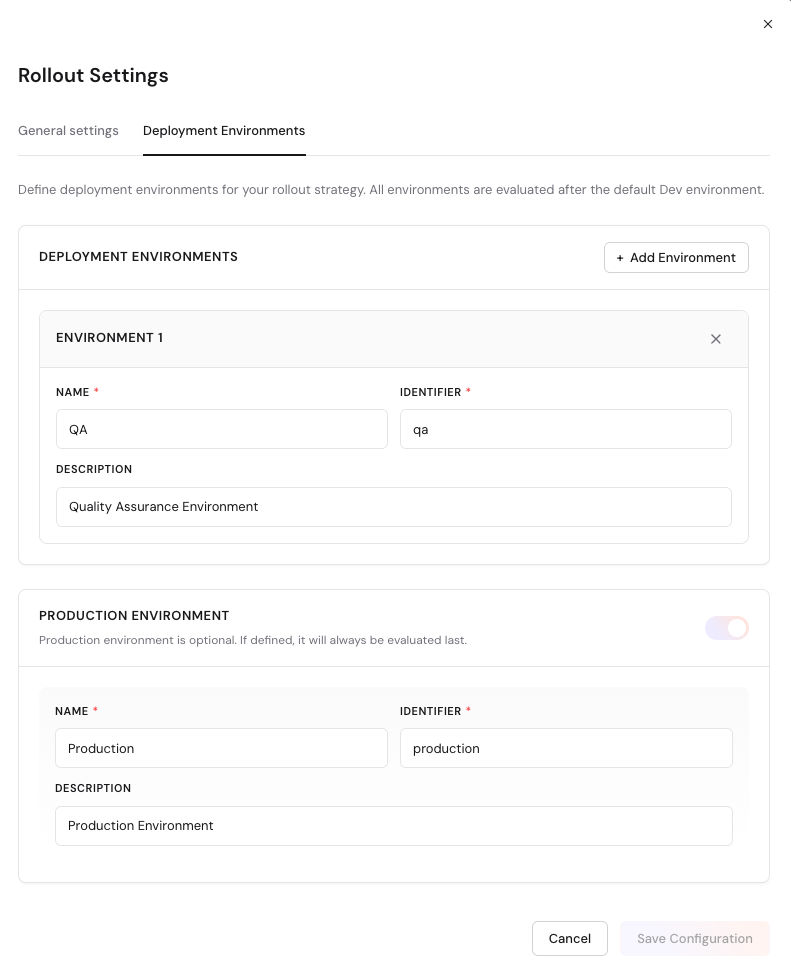
Add an Environment
- Click Add Environment.
- Enter a name and identifier for the new environment.
- Optionally, mark it as a production environment.
- Click Save.
Edit an Environment
- Click on an existing environment in the settings list.
- Modify its name, identifier, or production status.
- Click Save.
Delete an Environment
- Click the delete button next to the environment you want to remove.
- Confirm the deletion in the dialog.
- Click Save.
Deleting an environment removes it from the control board and all associated deployment data. This action cannot be undone.
Deployment Workflow
The typical deployment workflow follows these steps:
- Build — Create or update a component variant in the Component Builder.
- Publish — Publish the variant from the Component Builder.
- Select — In the Rollout screen, select the published variant for the target environment.
- Queue — The change is queued and marked with an Updated badge.
- Deploy — Click Deploy to push all queued changes to their target environments.
- Verify — Review the table to confirm the new versions are deployed.
Tips
- Use the Drifted badge to catch environments that have fallen behind Production.
- Queue multiple changes before deploying to reduce the number of deployment operations.
- Use the Discrepancies filter before a release to ensure all environments are aligned.
- Tag your components consistently to make filtering easier across teams.
- Click on a component name to navigate directly to its Component Builder page.
- Collapse the sidebar to get more space for the control board table.